Previewing on mobile and tablet
2 min read
Most families browse and book from a phone, not a desktop, so it's worth checking how your edits actually look at a smaller width before calling them done. The viewport toggle (top left of the page once you're previewing, or top right in Edit Mode) switches between Desktop, iPad, and Mobile.

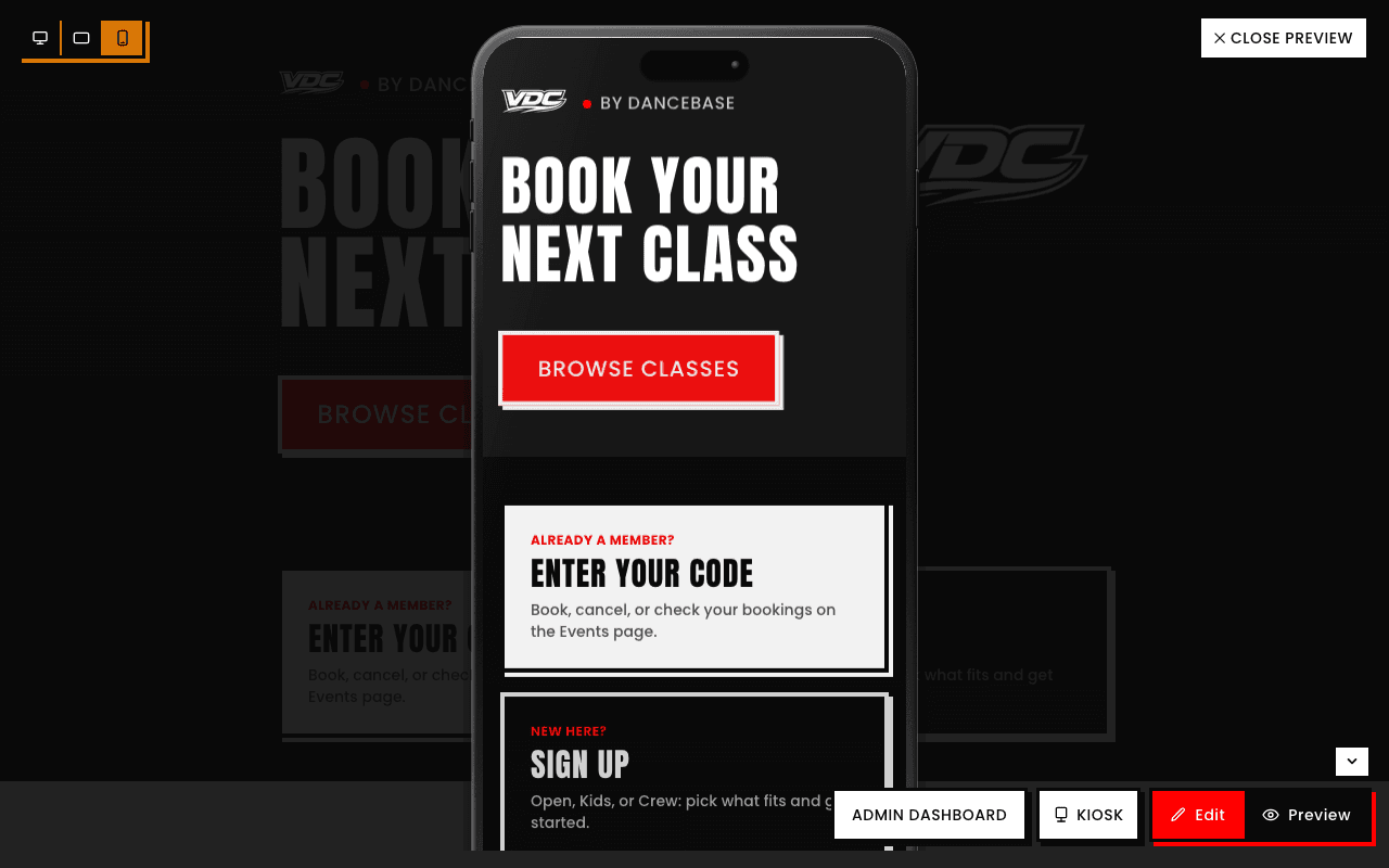
Layout can genuinely look different, not just smaller
Something that reads perfectly on Desktop can wrap awkwardly or crowd together at Mobile width, it's worth an actual check in each view, not an assumption that Desktop-looks-fine means Mobile does too.