Your studio's look: style & color
5 min read
A lot of booking software treats branding as an afterthought, a place to upload a logo and maybe pick from three washed-out theme colors, buried three menus deep. Dancebase treats it as one of the first real questions you answer, because your students see your site before they see anything else about your studio, and first impressions genuinely do carry weight.
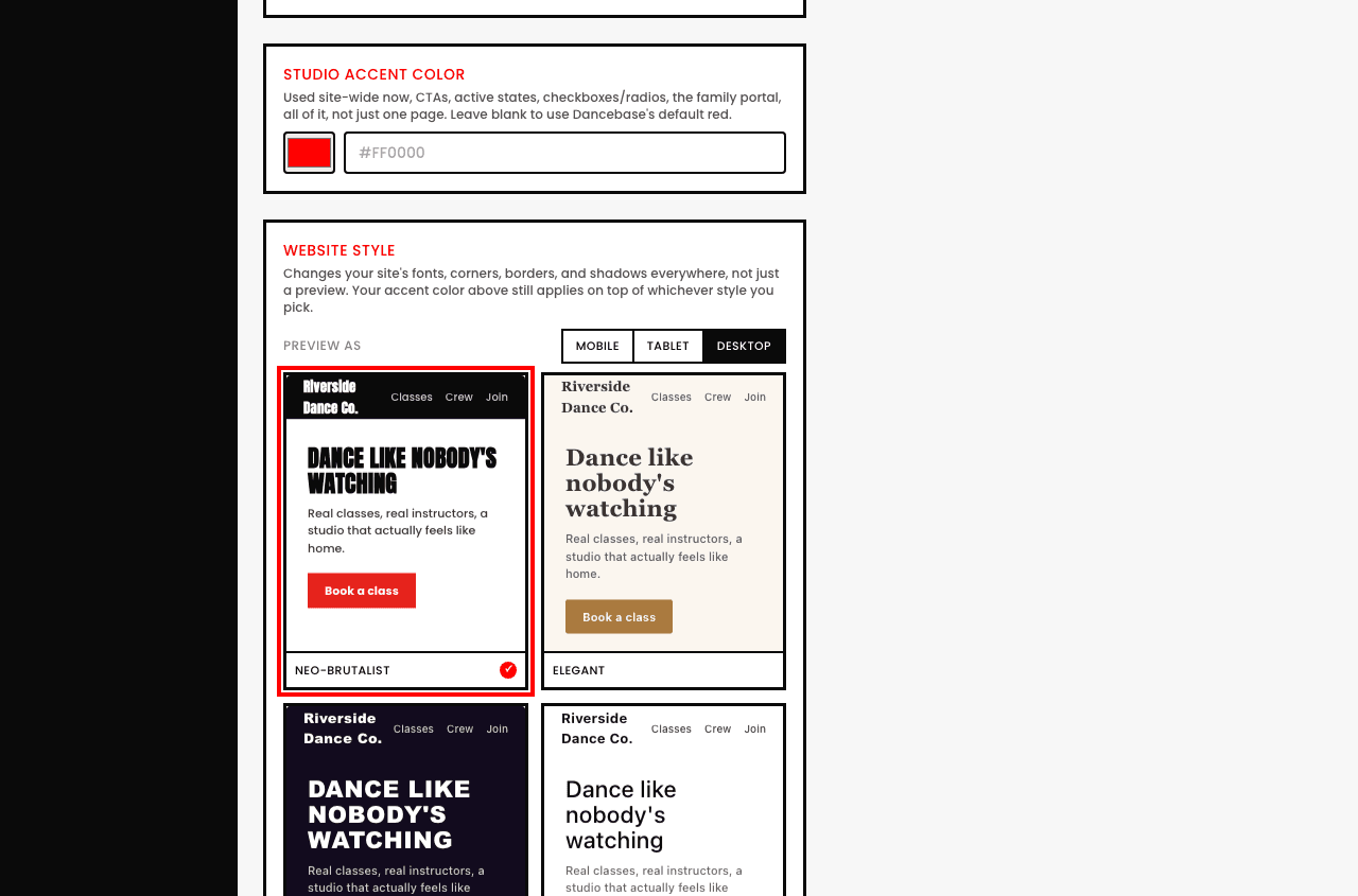
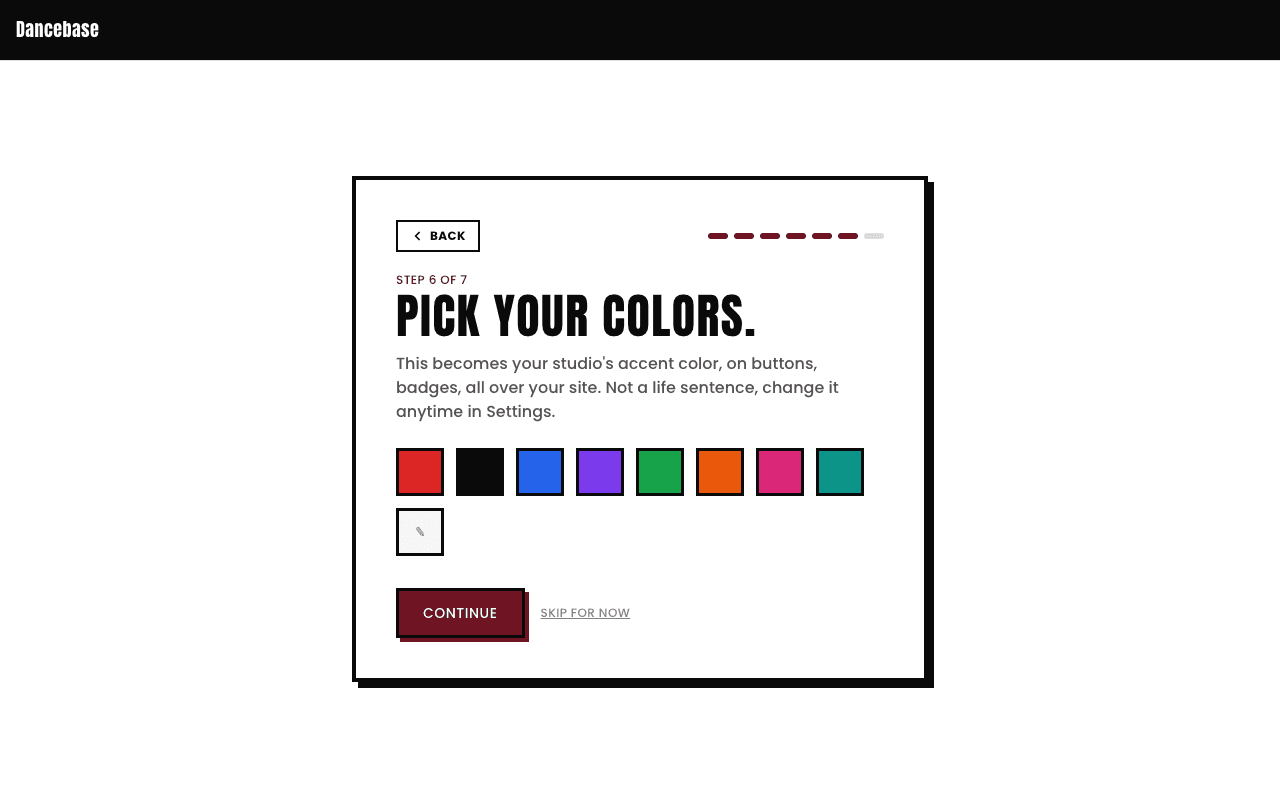
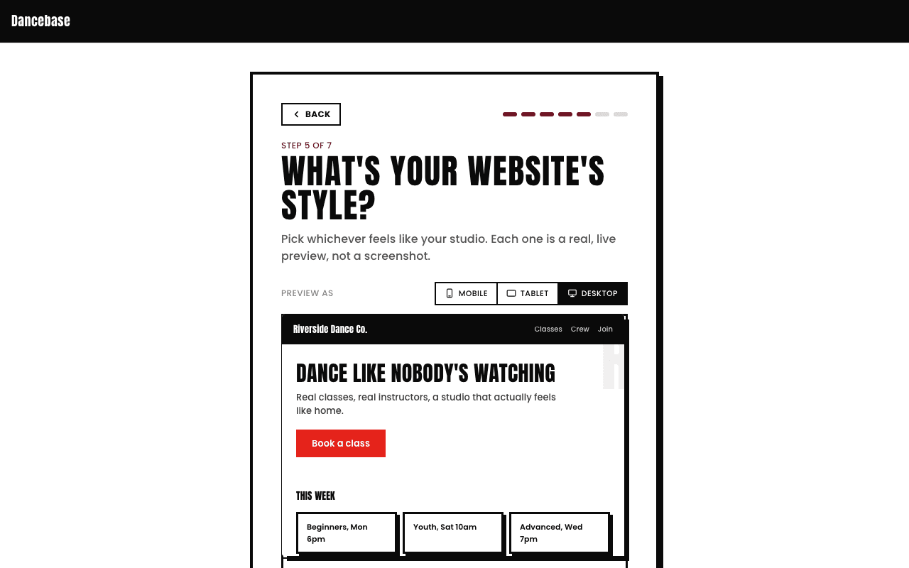
Two separate choices shape how your site looks, and they're designed to work together rather than fight each other: your website style (the fonts, corners, borders, and shadows your whole site is built from) and your accent color (whatever shows up on buttons, active states, and highlights). Change either one anytime from Settings → Website Style or Settings → Studio Accent Color, neither decision made during signup is permanent.
All eight styles, in detail
- Neo-Brutalist, the default. Thick black borders, sharp square corners, hard offset shadows that look like the element is physically sitting slightly off a white page. High contrast, impossible to scroll past without noticing.
- Elegant, warm and editorial. A cream background, soft rounded corners, a serif heading font, gentle borders instead of hard black lines. This is the style for a studio that wants to feel like a boutique.
- Bold & Vibrant, high energy and street. A dark purple background, rounded pill-shaped buttons, a soft pink glow instead of a hard offset shadow.
- Minimal, quiet and confident. A white background, clean lines, gentle corners, almost no visual noise at all, it deliberately gets out of the way and lets your actual class list and photos do the talking instead of the chrome around them.
- Vintage, retro poster, ticket-stub charm. A warm cream background, a deep red nav bar, dashed borders, and a serif display font that leans hand-lettered.
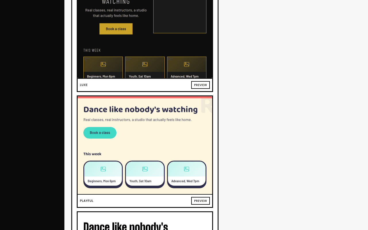
- Luxe, dark, gold, unmistakably upscale. A near-black background throughout, thin gold borders, a tall condensed heading font with wide letter-spacing.
- Playful, bright, bouncy, impossible not to smile at. A warm cream background, a coral-red nav bar, big rounded corners, and a chunky rounded heading font.
- Editorial, oversized type, magazine-cover confidence. A plain white background, no card borders or shadows at all, a huge, heavy display font doing all the work.
This is real, structural theming, not a color filter
How your accent color layers on top
Your accent color isn't tied to any one style, it rides on top of whichever one you've picked. A bright red "Book a class" button looks meaningfully different sitting inside Neo-Brutalist's hard-shadow box than it does inside Elegant's soft rounded one, but it's still unmistakably your color, your brand, either way. Eight curated presets are offered as a starting point, red, black, blue, purple, green, orange, pink, teal, or type in your own exact hex code if you've already got brand colors locked in from a logo or a uniform supplier.
- Changing your style or color takes effect immediately across your whole live site, there's no publish delay or caching lag to wait out.
- Nothing about switching styles or colors ever affects your existing bookings, payments, or student records, it's purely visual.
- Not sure which one fits? Try each style on for a minute using the live preview in Settings before committing, since you're looking at your actual real layout in every case, not a generic mockup.
See also